Reference distributions can also be used to create bullet graphs. A bullet graph is a variation of a bar graph developed to replace dashboard gauges and meters. The bullet graph is generally used to compare a primary measure to one or more other measures in the context of qualitative ranges of performance such as poor, satisfactory, and good. You can create a bullet graph by adding two reference lines: a distribution to indicate the qualitative ranges of performance, and a line to indicate the target.
-
Select two measures in the Data window. These measures
will be compared in the bullet graph. For example, budget vs. actual;
actual vs. target; etc.

-
Click the Show Me button in the toolbar.

-
Select Bullet Graph in the Show Me pane.

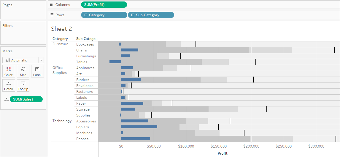
To quickly swap the two measures, right-click on the continuous axis and select Swap Reference Line Fields.

Edit each of the reference lines to change their definitions. For example, you may want to add 100%, or draw a line at a constant value.
This comment has been removed by the author.
ReplyDeleteHi, I read your whole blog. This is very nice. Good to know about the career in Tableau Training & Certification. We are also providing various Tableau Training , anyone interested can Tableau Training for making their career in this field .
ReplyDelete